
This tool has been created for nonprofit educational purposes & will remain free forever. All trademarks are the property of their respective owners.
Favicon/Logo
We recommend uploading a square file
Preview Window
.png) Compare with Competitors
Compare with Competitors


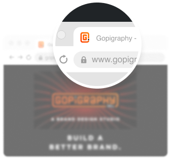
Favicon Checker is a free tool to test how your logo looks like as the favicon on your browser. You can also check how your favicon compares against other brands in your industry.
A favicon is a small 16x16 pixel version of your logo that is used for branding your website. It sits inside a tab at the top of your browser. A favicon also appears on your bookmark bar.
A good favicon helps to quickly identify your website when you have several tabs open at the same time which can help you increase the user experience for your website.
If you are a founder of a company that just got a logo designed, this tool would be useful to check two things: how your logo looks at a small 16x16 pixel size and how it compares against others players in your industry. You could then make changes to create a stronger & more powerful logo for your brand.
Additionally, if you are a brand identity designer, you can accurately check how the favicon will perform on a web browser without uploading it to your server.
The best solution is to redraw your logo to work at a 16x16 pixel size.
If that's not an option available to you, here are some ways to ensure better results:
1. A simple logo that has a strong form often performs better as a favicon. Too much detail can easily distort the appearance of your favicon.
2. If your logo is formed with outlines (as compared to a solid fill), it helps to increase the stroke size by a point or two for it to be more legible at smaller sizes.
3. 1-2 colors work best at 16x16 pixel size. Using fewer colors makes it clearer at smaller sizes.
The way your logo looks when viewed at a 16x16 size is often different from what you imagine it to look like. Even a 100% scale preview inside your editing software, or your picture viewer looks different than a browser window.
We faced this issue when we were designing the favicon for our own website. What looks good at a "normal" scale often looks distorted or illegible at a smaller scale.
We had to try out at least a dozen options before we finalised the one we use today. And each time we tested our logo, we had to export, upload, save & refresh our browsers to see the result.
We tried finding a tool that made this process easier but couldn't find one. And since we frequently create logos for our clients, we decided to make this tool to make our lives easier (and hopefully yours too)!
Gopigraphy is a global brand consultancy & design studio. We work with founders across borders to create powerful & impactful brands. We can help you influence how people feel about your product, service or business.
Watch our showreel